The Wiggle website had not been updated for a couple of years, mainly due to work on the backend systems which had to be done first. So it was quite exciting to be told we could finally start work on redesigning the product description page.
UX Researcher and Designer
Date: April 2017 - February 2018
Duration: 10 months
Project Owner: Ceri Lewis
Philippa Staley
Project Manager
Dan Jones
Business Analyst
Jeff Lam
Front-End Developer
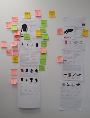
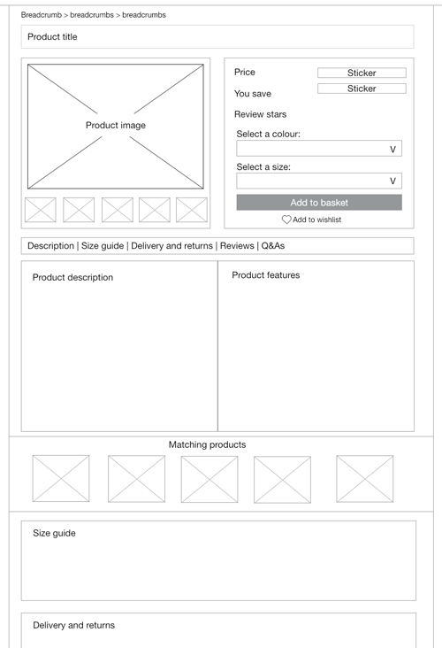
The first thing we did was a holistic review of the current design. This involved breaking the page down to its key components to see what was needed on the page, what was less important and what our opportunities were. This was based on our own thoughts and on past research.
As Wiggle is an e-commerce website, with no physical shops, it was really important that we got this right.
We believe that the product title, image and price are the most important pieces of information to show on the page.
After this a good description of the product is important, along with any key facts and figures, for instance what it is made from or if it is waterproof.
Information about delivery, returns and product reviews are important too.
But we also found things that were barriers to our customers.
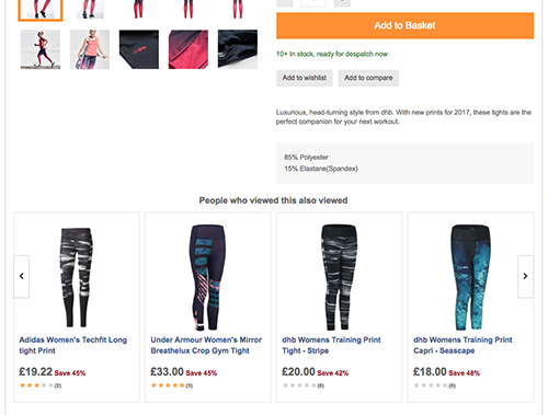
On the old design, straight after the images and ‘add to basket’ button was a carousel that showed items ‘people who viewed this also viewed’. It broke the whole flow of the page and stopped people from scrolling, even though there was still important information further down the page. I watched many research videos where users stop at this point and never scroll any further. This list was not always relevant to the product the customer was viewing either.
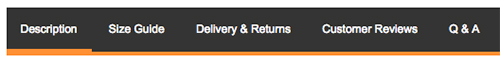
Then there were the tabs which hid important information from our customers and which Google Analytics showed no one clicked.
And as we started really looking at the pages we realised that there was often repeat information about either the brand or the product type. Although this could be useful information there was probably a better way of displaying this instead of on every page.
Next we wanted to test the page to see if our thoughts were right.
This is where we hit our first problem. We were using WhatUsersDo, a remote self moderated testing software, to see what people did when we asked them to find and buy a bike. This is when we realised that unless that person is fully invested in the purchase, all they will show us is that they can add the item to the basket.
Considering bikes are high value items, most people in this test did not even scroll down the page looking for details about why they should spend all this money.
Maybe my questions were poorly written, but there was one chap who did play along and showed me that if we could find the right person with the right product we would be able to test the page.
He was a proper cycling enthusiast and he found a bike he really liked and showed me exactly what I had expected when I had set up the test. He looked at the image and zoomed in; he scrolled down the page and checked out all the specifications; he looked at the reviews and read them all; then he looked at the price, gulped and even though he was not actually going to buy the bike went and found something cheaper.
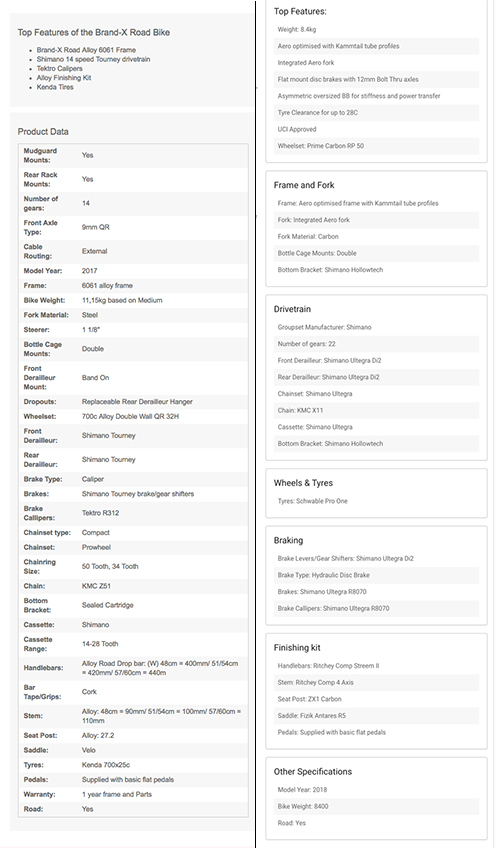
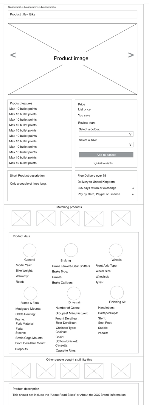
This single test showed us a lot about how people shop, and suggested to me that maybe we needed two templates. One for clothing and nutrition etc and one for bikes. This bike template would have a lovely big image at the top, allowing our bike lover the chance to get a really good close look at the thing of their dreams. But it would also break up the list of bike features which currently creates a massive hard to read list into sections so if you are interested in particular details they would be easy to find.
We knew from the analytics that our bike buyers tend to look at the bike of their dreams multiple times before hitting the buy button and I wondered if giving them a better view of the bike would help them to make that final decision.
The other template would have a more equal distribution of images and other information as people buying clothing or bike parts might be after a more equal distribution of images and information and quite often we do not have that many images of an item.
With all this in mind, I started to draft out wireframes for a new hierarchy of information, seeing as I had already been told we could not make any major back-end changes.
Everyone seemed reasonably happy with what I was coming up with but here we came across another problem.
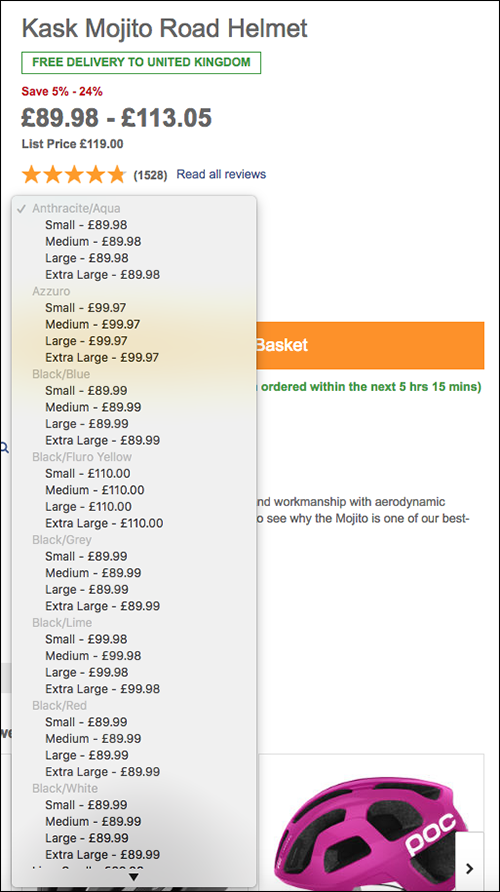
Most of our products come in several different sizes and colours, so we needed a way for a customer to select their options.
Outside of the project we had already agreed that the 'Add to Basket' button should always be highlighted and display an error message if the customer tried to buy a product without selecting an option. This was a winning A/B test too, and when applied to the site earlier gave a 1.8% increase in conversion.
But it was still confusing for a customer to see all the options and make a decision. When we reviewed the site we found there were four different ways to select an option across desktop and mobile. We needed a design which would work across all our products.
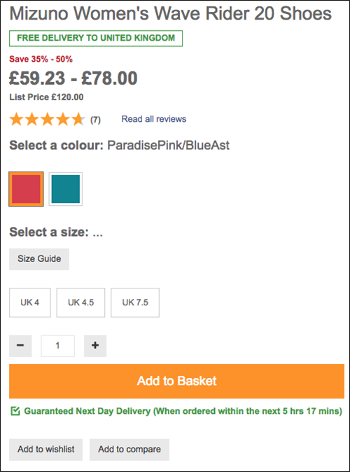
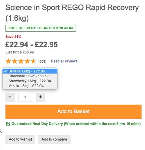
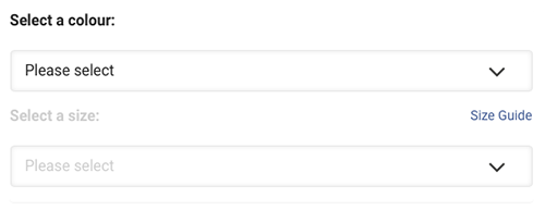
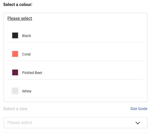
After a lot of thinking my colleague Ross came up with a nice idea which would allow us to show all the options along with stock messaging and the price (which could be different depending on what they selected) in an easy to use panel. When added to the mobile site before the rest of the project went live, this gave us a 2% increase in conversion.
The other major change I made was to take the short product description, which was small and repeated twice on the page, and make it bigger and easier to read.
With wireframes created I then worked closely with Jeff, our front-end developer, to create a prototype. This was coded and used real product information so we could check that everything would work on the page.
We ended up making multiple prototypes for different product types to make sure the template would work across our whole range, for instance products with really long titles, or products with either many options to select from or products with no options at all. This allowed us to check the design worked for everything.
After a good six months work, slowed due to working on more than one project at a time and constraints of resourcing, we finally passed our designs and prototype to the EPAM development team to build.
The showcase at the end of each sprint filled me with joy as I watched my designs come to life. Although I had worked closely with Jeff on the HTML prototype it was great to see it working on a massive range of products.
Finally it was ready with a two week roll out across our different sites, allowing us to test the page and check that there were no problems before going live to our biggest audience.
However, although the new design did well against the old design it did not have the expected increase in conversion. When we looked into it there were a couple of possible opportunities and so we set up A/B tests to see if we could make it better.
It was while we were looking for issues that I realised we had missed an important interaction. While designing the product selection panel we had specified that it should never be pre-selected, however once it was live we found out that a customer coming from Google Shopping will always land on a pre-selected product. This is a problem if it is not quite the right colour or size, or if it is out of stock.
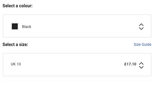
We needed to find a way to let a customer know that although they might have landed on the size 10 black trainer, other colours or sizes are avilable.
After some discussion across the team we decided on an arrow which stays in the drop down, even when selected. An A/B test found it increseed conversion the 1% we needed for the design to be a success. A slight modification to the arrow and it was put out across the live site.
Although this project ran for a little longer than expected it was a success, bringing the pages up to date and matching the new branding. From the testing we've done since, people are finding them much easier to use too.
As my first proper project for the company it was a learning curve, not just for me but for the whole project team. What we learnt working on this project and the Navigation project has fed into a review of the project process at the highest level, hopefully leading to projects which stay on track better.
There is still work to be done on the PDP. The selection panel could work better as it is hard to see if your colour and size are available without opening both drop downs. The size guides need some major improvements to get them to work on both desktop and mobile and I would love to see the inclusion of helpful guides on the page. For instance on the sports watch pages we could include the 'top 5 watches for running' guide.
If you have any questions about my work please feel free to contact me.
Email me on peneloperance@gmail.com or find me on Twitter or Linkedin.
Sign up to The UX Life Chose Me Newsletter and get the most interesting UX Research articles, videos and podcasts from across the web straight into your mailbox once a month.