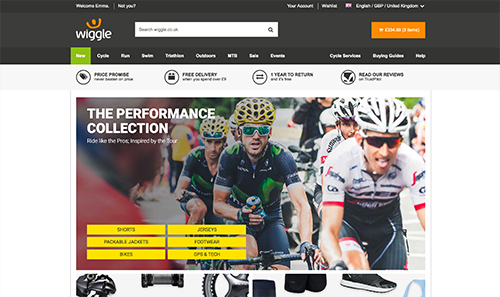
Wiggle is a global online sports clothing and equipment retailer which focuses on Tri sports - Cycle; Run; Swim.
At the beginning of 2017 I knew we would be starting work on two major changes to the website. Making it responsive and changing the navigation of the site. Although these were big projects in their own right it was decided to combine them as one massive project, although back then no-one realised quite how massive it would become.
UX Researcher and Designer
Date: January 2017 - September 2018
Duration: 20 months
Project Owner: John Bradford
Andy Morton
Project Manager
Ben Gray
Business Analyst
Phil Kendall
Developer Team Lead
This was a very big project and took up a lot of my time for nearly two years. I could write pages about how it went but I will try and keep it succinct.
The first thing we had to do was work out what was on the website already. What products did we sell, what products were we keeping and which were going, and were they living in the correct place. We worked with the Product Buyers to do this and ended up with a list of over 400 products.
I then turned these into cards which we could use for card sorting. Over the course of a couple of weeks I ran 14 sorts with internal staff and two with groups of external customers.
Each group was asked to sort about 150 cards in either an open sort where they then named the groups they had created or a closed sort where they sorted to group names that we had provided. While some categories were reasonably easy to sort, for instance clothing, the more technical items created some great debates. Interestingly our external customers did not use the word tri or triathlon at all while all our internal staff did.
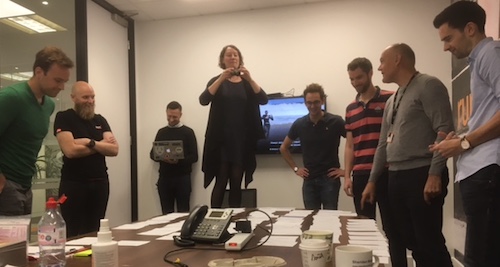
This was a great exercise to do with internal staff as it gave them a tiny taste of what UX is and got the conversation started with people we might not have approached otherwise.
With all the information we had gathered from subject matter experts and the card sorts, I then had the task of creating a new hierarchy for the website. Once again some of it was relatively easy but there were constraints, for instance the different categories had to work across different areas due to how the backend system worked. So I could not call them Running Shorts and Cycling Shorts but just Shorts. And I needed a lot of help with the more technical areas like bike parts - should a drive chain and a rear derailleur sit together?
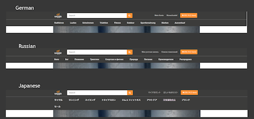
Once the hierarchy was created we met with the translation team to make sure that any new words had translations and that old words did not need to be amended due to the changes. For instance on the current site we used the phrase ‘jerseys and tops’ across all disciplines, but this might have been translated to just ‘tops’ for some languages if they did not have a word for jerseys. In the new hierarchy this would need to be amended otherwise we would end up with a navigation which goes Tops > Tops instead of Tops > Jerseys.
With a hierarchy that the team were mostly happy with we needed to test it with people outside the business to see if they could still find everything.
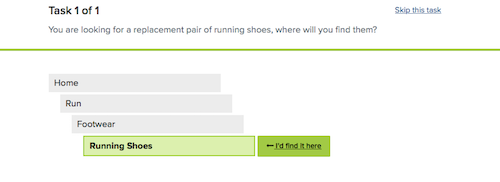
To do this we used an online tool called a Tree Jack from Optimal Workshop. To do this properly you have to set up two trees. One with your current hierarchy and one with your new hierarchy but ask people to find the same products in both. This allows you to see if you have improved your navigation or not. We ended up running two sets of these covering a range of 20 products in all. These included things we had moved drastically and top sellers. To get enough responses we put the links out across social media which worked really well. We were all very relieved when everything came out easier to find under the new hierarchy.
The next thing we had to design was the navigation bar which sits on every page of the site below the header. After much discussion we had two possibilities.
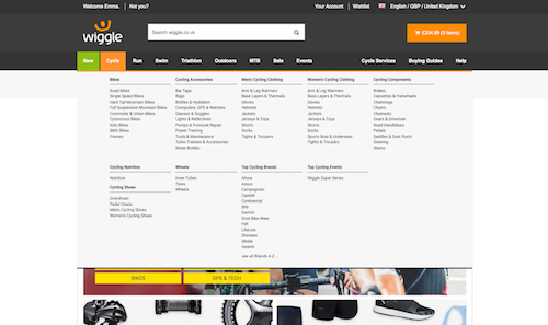
The current site lists the activities we cover - Cycle | Run | Swim | Triathlon | Gym | Outdoors | Nutrition | Brands | Sale
But what if we wanted to add more sports and activities in the future, we would soon run out of room on the bar, especially if we want Black Friday or Christmas up there too.
So I suggested changing it to Sports | Clothing | Tech | Nutrition | Brands | Sale
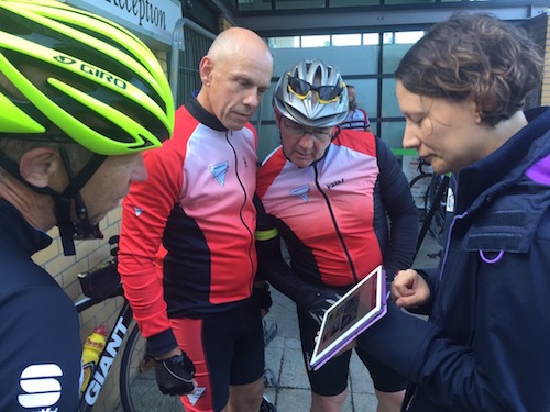
With push back from management we decided to test both to see which worked best. This found me and a colleague early one Sunday morning hanging out at one of the Wiggle events asking cyclists in the coffee queue if they could find a set of products using one or the other of the navigation bars. I had created a very quick Keynote presentation which let people on an iPad click through the navigation to a certain extent. It was not the best prototype ever but good enough to prove to me that both navigations worked equally well and management could decide without hurting the user journey.
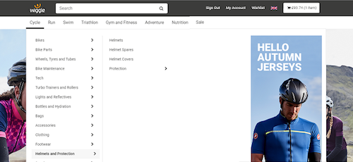
Now we had a hierarchy and a navigation bar agreed the development team could start to build it. I worked closely with Jeff our front end developer to make sure the interactions of the navigation would work correctly. With massive amounts of products we wanted to use progressive disclosure to help people find the thing they were looking for, but also make it easy for them to go back if that was not the right place. This might sound quite straight forward but it meant a lot of work for the team to get it to work smoothly.
The other problem we had here was while a prototype of the navigation had been created and signed off, it had been impossible to make it work for real as there was too much content that would be needed. As they started building we started to see that the prototype probably would not work in real life and we had to go back to the drawing board.
As we worked with the development team we realised that although there were some parts of the project that could be made live in stages, for instance the new header and footer, the big change of categories and the new style mega menu would have to be all in one go. With this added risk, my suggestion that maybe we should do some final testing went down well and with the new mega menu built and working on desktop, mobile and tablet I set up a round of lunch time tests.
Because the Wiggle offices are within a complex of offices I could contact people across the building asking if they would be interested in helping us with testing. Across three days we tested with 19 people, some who already knew Wiggle and some who did not, giving us a really good indicator of how well the menu on desktop, tablet and mobile worked for everyone.
These tests along with all the other testing going on in the backend, helped to raise confidence in the project across the business. It also raised some concerns about the mobile menu. Although I did know it was confusing I had been working on this project for too long now and gotten used to it. Having watched our users struggle to manoeuver round the products I knew the design needed to be amended. The main change was on how to move up and down the categories and to remove the animations which were adding to the confusion.
We had already re-ordered the top level navigation across all devices to put the most popular items at the top, but as we got closer to release we realised that the lower menus were still alphabetical which was not always the best option.
Because the order of these menus effects not just the area, but any other area that might also use that category, for instance Towels can be found in Swim, Gym and Outdoors, this took three days careful work to make sure the ordering made sense at each level for all areas.
But it was worth it, making sure that after a years worth of hard work we were not let down at the last moment by unoptimised menu ordering.
As the developers worked on each ticket I was involved with UAT to make sure each thing they build worked as expected, meaning that when we went live there should not be any nasty surprises.
While we had originally been due to go live in January 2018 the new menu finally went live in September. Some things still had not been done, like the re-ording of the menus and some of the back end amends which would have made it easier to make changes in the future, but the responsiveness of the site and the main menu changes were complete.
It was a massive project and could not have been done without a team who worked really well together. We learnt a lot and the process changed several times as we worked, to make it better for all of us.
Everyone is really pleased with the end result, but they have found it near impossible to untangle the benefits that came from the new menu against other things being updated in the site.
However the trend shows a positive correlation and they are confident enough to use the same navigation on their sister site, Chain Reactions Cycles, in the near future.
The main issue now is that the Product Buyers are still putting products in the wrong places, even following on from educational session around how to do it and why putting your product everywhere gives the wrong message.
Without their help the new menu will not be as successful as it should be, so on-going education session and co-oporation from the Buying Managers will be needed.
If you have any questions about my work please feel free to contact me.
Email me on peneloperance@gmail.com or find me on Twitter or Linkedin.
Sign up to The UX Life Chose Me Newsletter and get the most interesting UX Research articles, videos and podcasts from across the web straight into your mailbox once a month.