LTUX - UX Jam part 2
This week I was back at Rated People for the Ladies that UX, UX Jam part 2. Having learnt about volunteering with a charity last month, this time we were actually going to put it in to practice.
To be honest I was not really sure what to expect. About a week before we were sent a document which gave us a rough idea who we would be designing for, a charity called The Domestic Abuse Housing Alliance (DAHA) which is a charity dedicated to supporting people affected by domestic violence. They have no funding, the website will need to be updated by one lady (Guddy Burnet who created the charity) with no web skills and give information to a wide ranging audience from Joe Public to international Governments. We would have about an hour to come up with designs working with people we had not worked with before, although we might have made small talk in the past.
So you can see why I was a little daunted. Added to the fact that I am very much starting out in UX design. Would I even be able to contribute anything useful?
But in the end it was a really interesting and fun session. I was grouped with a bunch of lovely ladies (there were 7 of us in my group) who were all happy to have a say but also to listen.
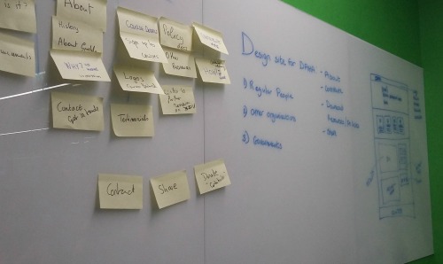
We started by looking at the current site, two pages of dry content aimed at officials, and made a list of the content already there and the information the brief had asked us to add.
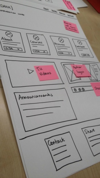
Once this was grouped to our liking we made a start on the homepage. Meanwhile some of the group had been looking at WordPress themes to see what the site might look like. No point reinventing something when there are some pretty nice free themes already out there. We were looking for something simple which would not need lots of photography. After all the charity does not have any money, and with this sort of subject you have to be careful not to patronise or to incite - easy to do with a photo. With a theme picked out it was quite straight forward to put together the homepage.
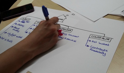
Then we created a site map which showed the other sections of the site. This was left as just major headings so that the content could inform the structure. Shorter pieces of information would sit together to create longer scrollable pages, while bigger sections could have their own pages. But without knowing the content well we left this up to Guddy to decide.
Then time was up and we needed to present our design to the group.
As always I was amazed at the variety that comes out of things like this when people start with the same brief and content. Yes there were similarities, there always will be, but there were many things which made me think, wow we did not even think of that!
At the end we voted on our favourites but the final decision will be Guddys. It would not surprise me if she takes the best of each design. I know that is what I would do.
It was a great session where I felt I did contribute even if I did not write anything down. I really hope this helps DAHA, to really make a difference for people who need it and I hope I get to work on more projects like this in the future.