Affordances and Signifiers
As a designer it is important for me to design things that people can work out how to use without them needing a pop up box explaining what to do every time, after all you can not do this with a pair of scissors or a door.
To do this we use affordances and signifiers. A lot of people have heard of these terms but are confused about what they actually mean or how it works with digital products, which is fair enough as they work very closely together to help show us how to use an object.
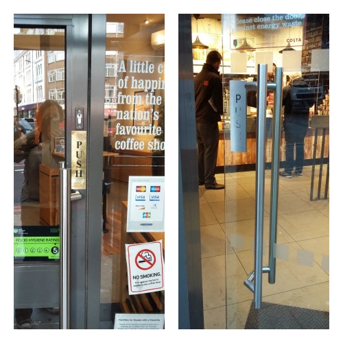
As we move through the world we come across many things we have never seen or used before, but we can generally work out how to use them. This is because the affordance of the thing gives us clues as to how to interact with it. Think about a door with a handle which indicates that we should pull it open. This is the affordance. Now think about how confusing it is when that door needs to be pushed instead, your brain sees the handle and knows this means it should be pulled, which is why you will pull that door even if you go through it everyday and know it needs to be pushed.
But when we think about the iPhone or iPad now we have a whole screen which gives the affordance of allowing us to touch it, but how do we know where to touch it? This is where the signifiers come in.
As a designer I need to make sure that I leave nice clear clues for my users as to what actions they can take. Buttons and menus should be obviously clickable, and other interactions like swipe or zoom should also be easy to find.
"The user will fly through the task then look up and say ‘that was easy’"
Yes we know that some users will play with the screen to find out what they can do, but there are many more users who will not do this and so without clues as to what they can do will miss a whole set of functionality.
I also believe this is an issue with flat design. In the past buttons normally had shadows round them showing that the button could be pressed. But as we have moved away from this, buttons have become flattened meaning the Call To Action (CTA) on the button needs to be much stronger to help users work out where to click.
This is where user testing can be very interesting. I have watched users try and click on everything except the one clickable object because it just is not clear to them where they should be going next. In this case it was as much an issue with the signifier as with the flow we wanted the user to take. When the design takes in all of these things, the signifier and the flow etc, the user will fly through the task then look up and say ‘that was easy’. This is how I want all my designs to turn out.
If you want to know more about this subject check out some of Don Norman's books and articles, as he came up with these terms in the first place and goes into much more detail about how they should be used.